Flipping over a piece of pottery and finding a “K” on the bottom is a fantastic starting point, but it's also where the real detective work begins. That one letter has been used by a huge range of makers, from the highly prestigious Königliche Porzellan-Manufaktur (KPM) in Germany to the powerhouse American producer, Knowles, Taylor & Knowles.
The secret to figuring out your piece isn't just the "K" itself, but its specific style and any other symbols hanging around it. This single initial has traveled across centuries and continents, so the details are everything. This guide is designed to help you connect those dots and uncover your pottery's unique story.
A Quick Reference Guide to K Pottery Marks

That "K" on your ceramic piece is a tantalizing clue to its origin, age, and potential value. But be prepared—it's one of the most diverse identifiers in the antiques world. It might stand for a specific kiln (known as kama in Japanese), a celebrated European factory, or even an individual artist's signature. Unlocking its true meaning always comes down to a close inspection of the mark itself.
Before you jump into identifying the maker, take a moment to look at how the mark was put on the piece. The application method alone can give you valuable hints about the production era and even the quality.
Mark Application Types
- Incised or Impressed: This is when a mark is pressed into the clay while it's still soft. You'll often see this on older pieces or items made in smaller studios.
- Printed: A mark applied with a stamp or transfer paper became very common for mass-produced wares, especially after the Industrial Revolution kicked into high gear.
- Hand-Painted: A mark painted on by hand could be an artist's personal sign-off or a simple factory decorator's mark. The style can vary wildly.
Getting these fundamentals down is essential. For a wider view and to sharpen your skills, our comprehensive guide to vintage pottery marks provides great context for recognizing all kinds of styles and symbols. This initial analysis is the perfect prep for digging into the specific "K" marks we'll cover here.
Diving into German KPM and the Royal Sceptre Mark
![]()
If you're digging into any k pottery mark, the initials KPM are bound to pop up. They represent one of the biggest names in European porcelain history: Königliche Porzellan-Manufaktur, which is German for the Royal Porcelain Factory in Berlin. This legendary maker has been the gold standard for quality and artistry for centuries.
The KPM story starts way back in the 1750s. In 1763, Frederick the Great gave the factory its official name and its iconic trademark: the royal blue sceptre. From that point on, KPM became synonymous with exquisite, high-quality porcelain, beautifully blending artistic styles from different eras. This rich history makes genuine KPM pieces incredibly valuable to collectors. You can learn more about the fascinating history of KPM and its famous sceptre mark at antique-marks.com.
This incredible heritage means that a real KPM piece isn't just a bit of pottery; it's a slice of art history. Of course, with that kind of reputation comes a long history of fakes and imitations, which makes learning to spot the real deal absolutely critical for any serious collector.
How to Spot the Iconic Sceptre Mark
The secret to authenticating a piece of Berlin KPM isn't just about finding the initials—it's all about the symbol that goes with them: the royal blue sceptre. This emblem, which comes from the electoral arms of Brandenburg, is the factory's official trademark.
The sceptre is almost always applied in underglaze blue, and that's your first big clue. If you see a mark that's sitting on top of the glaze, you should be immediately suspicious. The sceptre’s style and sharpness also changed over time, giving you even more clues to help date a piece.
Expert Tip: On an authentic 18th-century KPM piece, the sceptre mark should look sharp and finely detailed, clearly painted by a confident hand. As production methods changed, marks from the late 19th and early 20th centuries tend to look a bit thicker and less refined.
A Guide to Variations and Eras
The KPM sceptre mark rarely stood alone. Depending on when a piece was made, you'll often find it alongside other symbols that tell you more about its production and decoration.
- Rococo and Neoclassical Periods (c. 1763-1800): In these early years, the simple, hand-painted blue sceptre was the standard. The mark's delicate elegance is a perfect match for the artistically ambitious porcelain of the era.
- 19th Century Additions: Through the 1800s, an orb and cross (known as the Reichsapfel) was frequently added above the sceptre, especially on painted items. You might also spot painter's marks or impressed numbers near the main mark.
- The KPM and Eagle Mark: For a very specific period, from 1837 to 1844, the Prussian eagle was added to the mark, shown holding the sceptre and orb. This is a distinct and highly sought-after variation.
Learning to recognize these subtle differences is key. A mismatched mark and style—like a 20th-century mark on a plate that looks Rococo—is a massive red flag. It could signal a forgery or a piece that was decorated much later. Always look at the mark, the shape of the item, the style of decoration, and the glaze together to make a confident call.
Deciphering Japanese Pottery Marks with a K
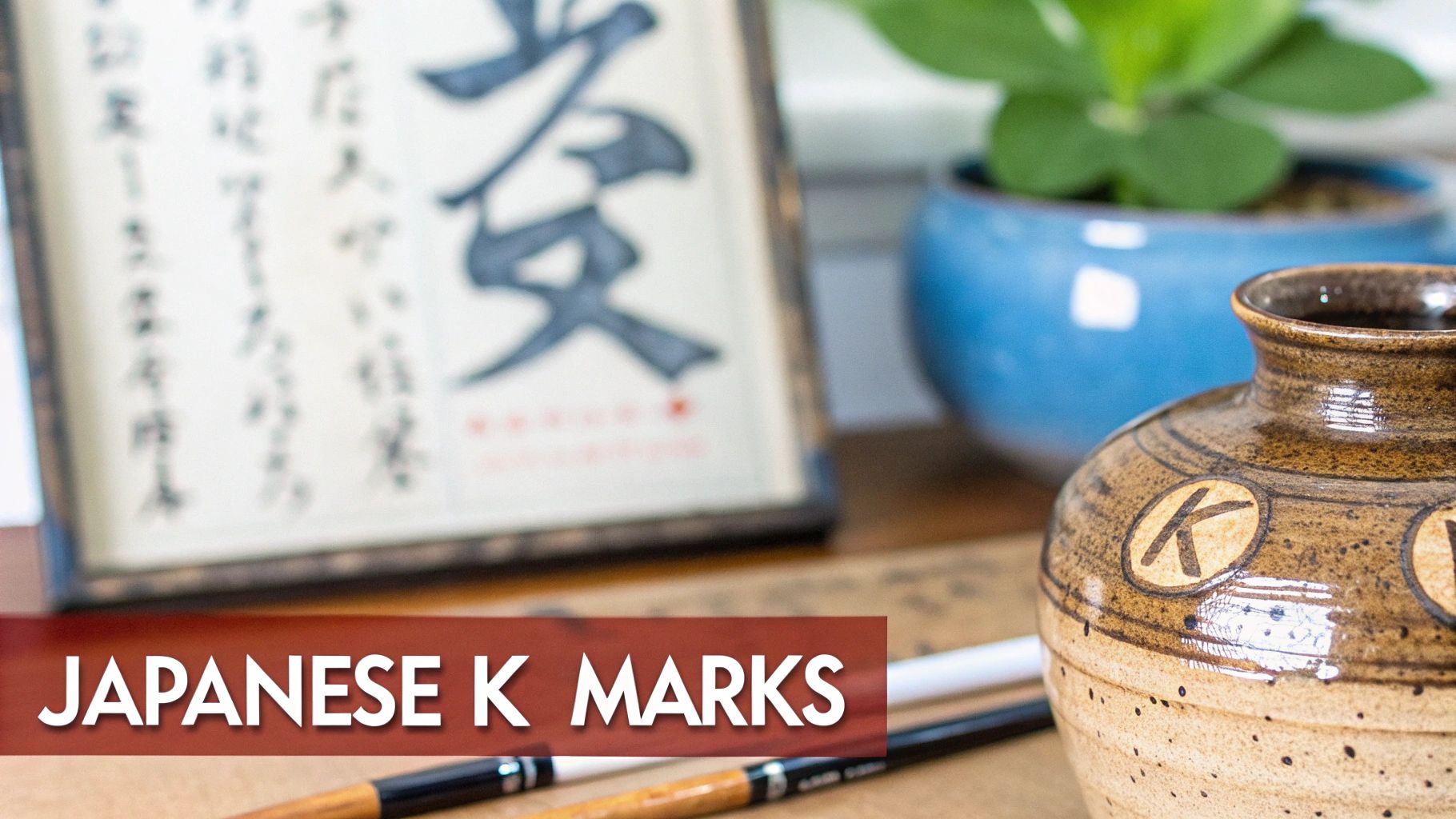
Finding a k pottery mark on a piece of Japanese ceramic ware is the start of a fascinating, but sometimes tricky, investigation. In the world of European or American pottery, a single letter often points straight to a specific factory. But with Japanese pieces, it's rarely that simple.
A 'K' mark on Japanese pottery is less like a manufacturer's logo and more like a clue within a much larger puzzle. It could represent the potter, the decorator, the exporter, or even the kiln where it was fired. This system was driven by commerce, not by the imperial reign marks you see on Chinese porcelain. If you want to dive deeper into this unique system, the collection of 20th-century Japanese marks at Gotheborg.com is an excellent resource.
So, when you see a 'K', you have to look at the whole picture—the style, the quality, and any other marks present—to figure out what it truly means.
Common "K" Marks in Japanese Ceramics
So, what could that 'K' stand for? The answer really depends on the style of the letter and the age of the piece.
Here are a few of the most common possibilities you'll come across:
- Kutani (九谷): This is one of the most celebrated names in Japanese porcelain. While you'll often see the full "Kutani" name or its kanji character, a simple 'K' can sometimes be part of a larger mark tied to a specific Kutani artist or studio.
- Kama (窯): This is the Japanese word for "kiln." A mark with a 'K' could be shorthand for a particular kiln, especially on studio pottery where the kiln's reputation was part of its appeal.
- Kaisha (会社): Meaning "company," a 'K' could easily be the initial of a trading or export company. This was particularly common during the Meiji period (1868–1912) when Japanese goods flooded Western markets.
The Role of Export Marks
The late 19th and early 20th centuries were a boom time for Japanese pottery exports. Critically for us, U.S. trade laws from that era give us some fantastic dating clues. The McKinley Tariff Act of 1890 mandated that imported goods be marked with their country of origin.
A piece marked "Nippon" was most likely made for export between 1891 and 1921. After 1921, the U.S. required the English word "Japan," so a "Made in Japan" stamp points to a later date.
When you find a 'K' alongside one of these country-of-origin marks, you can narrow down the production timeframe considerably. A piece with both a 'K' and a "Nippon" stamp, for instance, was almost certainly made for the American market within that specific 30-year period. This combination of a maker's initial and a country stamp is a classic feature of Japanese export ware from that prolific era.
Diving Into American Pottery Marks With a 'K'
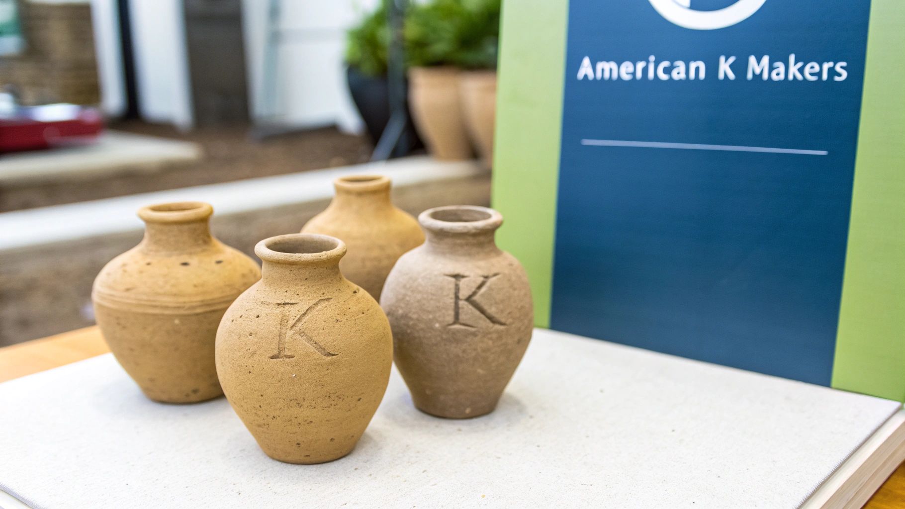
When you're hunting for antique ceramics, it's easy to get caught up in the big European and Asian names. But don't overlook America's own rich pottery history. A surprising number of U.S. companies used a k pottery mark, especially during the ceramics boom in the late 19th and early 20th centuries. Spotting one of these marks at a flea market could be your ticket to a great domestic find.
Unlike the often intricate systems of Japanese kilns or the royal seals on German porcelain, American marks tend to be more direct. Many simply stand for the company's name, which makes your job a little easier once you know who to look for. One of the biggest players you'll encounter is Knowles, Taylor & Knowles.
Knowles, Taylor & Knowles (KT&K)
Based in East Liverpool, Ohio, Knowles, Taylor & Knowles was a powerhouse in American pottery, founded way back in 1854. For decades, this factory was a massive producer of semi-vitreous porcelain and durable white granite wares. It's no surprise their pieces are still popular with collectors today.
You can often spot a KT&K piece by its backstamp. Many feature the company’s initials, sometimes worked into a neat monogram or paired with an eagle. If you see that eagle, it almost always dates the piece to after 1879.
- Early Marks (Pre-1890): The older pieces usually have a simple stamped or impressed "K.T.&K." mark.
- Later Marks (Post-1890): As the company grew, the marks became more detailed. You’ll see backstamps that include the pattern name or specify the material, like "SEMI-VITREOUS PORCELAIN."
Quick Identification Tip: Get a feel for the piece. KT&K wares were built for everyday life, so they have a solid, heavy feel. This sturdy ironstone or semi-vitreous body is a world away from the delicate, translucent porcelain coming out of Europe at the time.
Other American 'K' Marks to Know
KT&K was a giant, but plenty of other smaller potteries and art studios across the country used a 'K' in their mark. These can be trickier to pin down but often lead to some really interesting, artisanal finds. Think of companies like the Keystone Pottery Co. out of Trenton, New Jersey—they also played a role in America's ceramic story.
To identify these regional makers, you have to look beyond the letter itself. What's the clay like? How was it glazed? What kind of decorations were used? These clues are essential. For instance, if you're interested in regional American pottery, our guide on Camark pottery marks provides a fantastic look at how another local factory developed its brand. The more you familiarize yourself with different American styles, the sharper your eye will become.
Analyzing Your Mark for Accurate Identification
Finding a k pottery mark is just the first step. The real detective work starts now, and it's easy to jump to conclusions. A methodical approach is your best bet for getting a correct identification.
The first thing to look at is how the mark was applied. This simple detail can tell you a lot about the piece's age and how it was made. An impressed mark, for instance—one pushed right into the wet clay—often points to an older or studio pottery piece. On the other hand, a printed mark found under the glaze usually signals mass production, common from the 19th century forward.
Creating a Mark Profile
To keep everything straight, you'll want to document every detail you can see. Think of it as creating a profile for your mark. This record will be invaluable when you start digging through databases and reference books, and it'll save you from constantly re-examining the item.
Here’s a quick checklist to make sure you don't miss anything important about your k pottery mark:
- Application Method: Is the mark impressed, incised (scratched), printed, or painted by hand?
- Color and Glaze: What color is it? Common examples include underglaze blue, iron red, or black enamel. Is it under or over the final glaze?
- Placement: Where on the piece did they put it? Most marks are on the base, but they can sometimes be on the side or even tucked away inside a lid.
- Accompanying Symbols: Is the 'K' alone, or are there other things with it? Look closely for crowns, shields, animals, numbers, or other letters—these are huge clues.
A great tip is to take clear, well-lit photos. A good picture makes it so much easier to compare your mark to examples online or to get a second opinion from an expert.
Once you have all your notes, it’s time to consult some reliable sources. A quick web search can get you started, but specialized antique mark databases and collector forums will give you much more accurate results. If you want to better understand what all these different characteristics mean, our guide to the various types of markings on pottery is a great resource. Pairing sharp observation with focused research is the secret to figuring out what you have.
Common Mistakes When Identifying K Pottery Marks
Finding a 'K' mark on a piece of pottery is that first thrill of the hunt, but it's easy to take a wrong turn on the path to a proper ID. One of the most common stumbles I see is with the various "KPM" marks. Everyone wants to find a piece from the prestigious Königliche Porzellan-Manufaktur Berlin, but its mark was so widely copied that it's often mistaken for work from less-valuable factories like Krister Porzellan Manufaktur.
Another classic pitfall is trying to make an identification based on a fuzzy, partial, or worn mark. I get it—it's tempting to see what you want to see in a faint stamp. But jumping to conclusions based on a fragment of a letter is a recipe for disappointment. The piece itself will always tell you more than a blurry symbol ever could.
Look Beyond the Mark Itself
A maker's mark is just one clue, not the whole story. To get it right, you have to look at the entire object and see if everything lines up.
The biggest mistake a collector can make is "mark-hunting"—focusing so intently on the symbol on the bottom that they ignore the story the rest of the piece is telling. The form, glaze, weight, and decorative style are equally important clues.
For a truly confident assessment, you need to play detective and cross-reference these key elements. Does the whole picture make sense?
- Form and Shape: Does the shape of that vase or teacup actually match what that specific factory was producing during that time? A quick search can often show you a company's typical forms from a given decade.
- Glaze and Clay Body: Look at the color and feel of the glaze. An 18th-century piece shouldn't have the look and feel of a 20th-century glaze. The weight and color of the porcelain or clay underneath are also huge giveaways.
- Decorative Style: Does the hand-painted flower or printed pattern fit the artistic style of the period it supposedly came from? An Art Nouveau design on a piece marked for the 1840s is a major red flag.
By taking this holistic approach, you stop just matching symbols and start reading the object. It's a much more reliable way to identify your pottery, protects you from making a costly mistake, and honestly, it’s what makes collecting so rewarding.
Frequently Asked Questions About Pottery Marks with a 'K'
When you're trying to identify pottery, a simple letter like 'K' can lead you down a rabbit hole of questions. It's one of the more common letters you'll find, so let's clear up a few of the most frequent queries that collectors and enthusiasts run into.
Does KPM Always Stand for the Royal Berlin Factory?
Not always, and this is a classic point of confusion. While the world-renowned Königliche Porzellan-Manufaktur Berlin is the most famous "KPM," other German factories also used these initials. A notable example is the Krister Porzellan Manufaktur.
The real tell is in the details. A genuine piece from the Royal Berlin factory will almost always feature their distinct royal blue sceptre mark alongside the letters. If you suspect you have a true KPM Berlin piece, you'll need to compare the entire mark—the style of the letters, the sceptre, everything—against authenticated examples to be certain.
What Does a 'K' Inside a Shape Mean on Japanese Pottery?
Finding a 'K' inside a circle (maru) or a square (kaku) on a piece of Japanese ceramic points to a different system entirely. Unlike Western marks that often represent a single large company, these Japanese marks usually identify a specific kiln, a particular decorator, or even an exporter.
This practice was part of Japan's intricate production and export network. To nail down a precise identification, you'll need to consult specialized guides on Japanese ceramics, as the meaning can vary greatly depending on the shape and the style of the 'K'.
How Much Does the Condition of a Mark Affect a Piece's Value?
A crisp, clear mark is always a plus. It makes identification and dating straightforward, which gives collectors confidence and can definitely boost the piece's value and desirability.
On the other hand, a smudged, worn, or partial mark can make attribution a real challenge, potentially lowering its value for collectors who prioritize a confirmed history. However, it's good to remember that the mark is just one piece of the puzzle. The overall condition, rarity, and artistic merit of the piece itself often play a much bigger role in its final value.
Still staring at a mark and feeling stumped? Expert help is closer than you think. Just snap a picture with the Curio app to get a quick identification, learn about its history, and see an estimated value. Download Curio today and let your antiques tell their story!